Yeah the King Tyshawn Tut is one that I’ve definitely commented on a few times after we got it in the shop. Seriously bad. Looks bad, was a bad idea for a graphic, AND it’s badly executed.
Sorry…thought you said King not Hop King! Hop King are worse!!
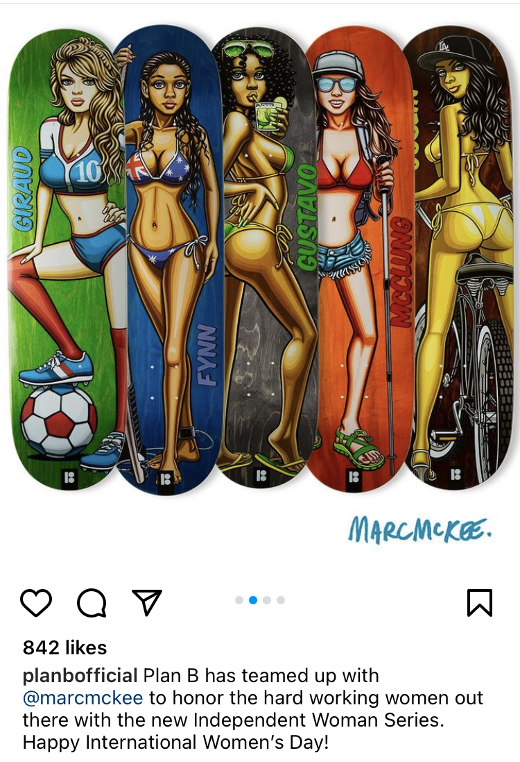
Mckee had a sketch of a recent graphic on his insta for about an hour until i assume he got a lot of hate mail and deleted it. It was a cheerleader getting chainsawed in half, the long way. Rate mckee but fuckin hell m8
I remember skating Liverpool one Saturday waaaay back in my teens and it being particularly busy with Police, like oddly busy with bizzies. Got home (I lived on South Wirral) and found they’d bombed Warrington.
It’s a Plan B Mike Carroll deck, and the graphic is the 90s era logo and rainbow design used by a pro-paedophilia organisation called the ‘North American Man/Boy Love Association’.
I have a vague recollection, I’ve no idea where from, of someone talking about the proposed original logos for Big Brother magazine and one idea was a circle with a silhouette of two male figures, one short and the other tall, possibly hand in hand. It wasn’t used as it looked like it could have been the logo for Nambla. I think I might have seen a mock up somewhere and, you know what, it did.
Yeah, it was only a vague, fuzzy memory but a T shirt makes sense. I kinda think that maybe Carnie or Tremaine or someone discussed it somewhere but I really can’t remember.